CSS3 filter Property
Example
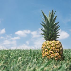
Change the color of all images to black and white (100% gray):
img {
-webkit-filter: grayscale(100%); /* Chrome, Safari,
Opera */
filter: grayscale(100%);
}
Tip: More "Try it Yourself" examples below.
Definition and Usage
The filter property defines visual effects (like blur and saturation) to an element (often <img>).
| Default value: | none |
|---|---|
| Inherited: | no |
| Animatable: | yes. Read about animatable |
| Version: | CSS3 |
| JavaScript syntax: | object.style.WebkitFilter="grayscale(100%)" Try it |
Browser Support
The numbers in the table specify the first browser version that fully supports the property.
Numbers followed by -webkit- specify the first version that worked with a prefix.
| Property | |||||
|---|---|---|---|---|---|
| filter | 18.0 -webkit- | 13.0 | 35.0 | 9.1 6.0 -webkit- |
15.0 -webkit- |
Note: Older versions of Internet Explorer (4.0 to 8.0) supported a non-standard "filter" property that has been deprecated. This was mostly used for opacity when needed support from IE8 and down.
CSS Syntax
filter:
none | blur() | brightness() | contrast() | drop-shadow() | grayscale() | hue-rotate()
| invert() | opacity() | saturate() | sepia() | url();
Tip: To use multiple filters, separate each filter with a space (See "More Examples" below).
Filter Functions
Note: The filters that use percentage values (i.e. 75%), also accept the value as decimal (i.e. 0.75).
| Filter | Description | Play it |
|---|---|---|
| none | Default value. Specifies no effects | Play it » |
| blur(px) | Applies a blur effect to the image. A larger value will
create more blur. If no value is specified, 0 is used. |
Play it » |
| brightness(%) | Adjusts the brightness of the image. 0% will make the image completely black. 100% (1) is default and represents the original image. Values over 100% will provide brighter results. |
Play it » |
| contrast(%) | Adjusts the contrast of the image. 0% will make the image completely black. 100% (1) is default and represents the original image. Values over 100% will provide results with less contrast. |
Play it » |
| drop-shadow(h-shadow v-shadow blur spread color) | Applies a drop shadow effect to the image. Possible values: h-shadow - Required. Specifies a pixel value for the horizontal shadow. Negative values place the shadow to the left of the image. v-shadow - Required. Specifies a pixel value for the vertical shadow. Negative values place the shadow above the image. blur - Optional. This is the third value, and must be in pixels. Adds a blur effect to the shadow. A larger value will create more blur (the shadow becomes bigger and lighter). Negative values are not allowed. If no value is specified, 0 is used (the shadow's edge is sharp). spread - Optional. This is the fourth value, and must be in pixels. Positive values will cause the shadow to expand and grow bigger, and negative values will cause the shadow to shrink. If not specified, it will be 0 (the shadow will be the same size as the element). Note: Chrome, Safari and Opera, and maybe other browsers, do not support this 4th length; it will not render if added. color - Optional. Adds a color to the shadow. If not specified, the color depends on the browser (often black). An example of creating a red shadow, which is 8px big both horizontally and vertically, with a blur effect of 10px: filter: drop-shadow(8px 8px 10px red); Tip: This filter is similar to the box-shadow property. |
Play it » |
| grayscale(%) | Converts the image to grayscale. 0% (0) is default and represents the original image. 100% will make the image completely gray (used for black and white images). Note: Negative values are not allowed. |
Play it » |
| hue-rotate(deg) | Applies a hue rotation on the image. The value defines the number of
degrees around the color circle the image samples will be adjusted. 0deg is
default, and represents the original image. Note: Maximum value is 360deg. |
Play it » |
| invert(%) | Inverts the samples in the image. 0% (0) is default and represents the original image. 100% will make the image completely inverted. Note: Negative values are not allowed. |
Play it » |
| opacity(%) | Sets the opacity level for the image. The opacity-level describes the transparency-level, where: 0% is completely transparent. 100% (1) is default and represents the original image (no transparency). Note: Negative values are not allowed. Tip: This filter is similar to the opacity property. |
Play it » |
| saturate(%) | Saturates the image. 0% (0) will make the image completely un-saturated. 100% is default and represents the original image. Values over 100% provides super-saturated results. Note: Negative values are not allowed. |
Play it » |
| sepia(%) | Converts the image to sepia. 0% (0) is default and represents the original image. 100% will make the image completely sepia. Note: Negative values are not allowed. |
Play it » |
| url() | The url() function takes the location of an XML file that specifies an
SVG filter, and may include an anchor to a specific filter element. Example: filter: url(svg-url#element-id) |
|
| initial | Sets this property to its default value. Read about initial | |
| inherit | Inherits this property from its parent element. Read about inherit |

More Examples
Blur Example
Apply a blur effect to the image:
img {
-webkit-filter: blur(5px); /* Chrome, Safari,
Opera */
filter: blur(5px);
}
Brightness Example
Adjust the brightness of the image:
img {
-webkit-filter: brightness(200%); /* Chrome, Safari,
Opera */
filter: brightness(200%);
}
Contrast Example
Adjust the contrast of the image:
img {
-webkit-filter: contrast(200%); /* Chrome, Safari,
Opera */
filter: contrast(200%);
}
Drop Shadow Example
Apply a drop shadow effect to the image:
img {
-webkit-filter: drop-shadow(8px 8px 10px red); /* Chrome, Safari,
Opera */
filter: drop-shadow(8px 8px 10px red);
}
Grayscale Example
Convert the image to grayscale:
img {
-webkit-filter: grayscale(50%); /* Chrome, Safari,
Opera */
filter: grayscale(50%);
}
Hue Rotation Example
Apply a hue rotation on the image:
img {
-webkit-filter: hue-rotate(90deg); /* Chrome, Safari,
Opera */
filter: hue-rotate(90deg);
}
Invert Example
Invert the samples in the image:
img {
-webkit-filter: invert(100%); /* Chrome, Safari,
Opera */
filter: invert(100%);
}
Opacity Example
Set the opacity level for the image:
img {
-webkit-filter: opacity(30%); /* Chrome, Safari,
Opera */
filter: opacity(30%);
}
Saturate Example
Saturate the image:
img {
-webkit-filter: saturate(800%); /* Chrome, Safari,
Opera */
filter: saturate(800%);
}
Sepia Example
Convert the image to sepia:
img {
-webkit-filter: sepia(100%); /* Chrome, Safari,
Opera */
filter: sepia(100%);
}
Combining Filters / Multiple Filters
To use multiple filters, separate each filter with a space.
Note: Order is important (i.e. using grayscale() after sepia() will result in a completely gray image).
img {
-webkit-filter: contrast(200%) brightness(150%); /* Chrome, Safari,
Opera */
filter: contrast(200%) brightness(150%);
}
All Filters
A demonstration of all filter functions:
.blur {
-webkit-filter: blur(4px);
filter: blur(4px);
}
.brightness {
-webkit-filter:
brightness(0.30);
filter: brightness(0.30);
}
.contrast {
-webkit-filter:
contrast(180%);
filter: contrast(180%);
}
.grayscale {
-webkit-filter:
grayscale(100%);
filter: grayscale(100%);
}
.huerotate {
-webkit-filter:
hue-rotate(180deg);
filter: hue-rotate(180deg);
}
.invert {
-webkit-filter:
invert(100%);
filter: invert(100%);
}
.opacity {
-webkit-filter:
opacity(50%);
filter: opacity(50%);
}
.saturate {
-webkit-filter:
saturate(7);
filter: saturate(7);
}
.sepia {
-webkit-filter:
sepia(100%);
filter: sepia(100%);
}
.shadow {
-webkit-filter:
drop-shadow(8px 8px 10px green);
filter: drop-shadow(8px 8px 10px green);
}
Try it Yourself »
Related Pages
HTML DOM reference: filter property

