W3.CSS Tutorial
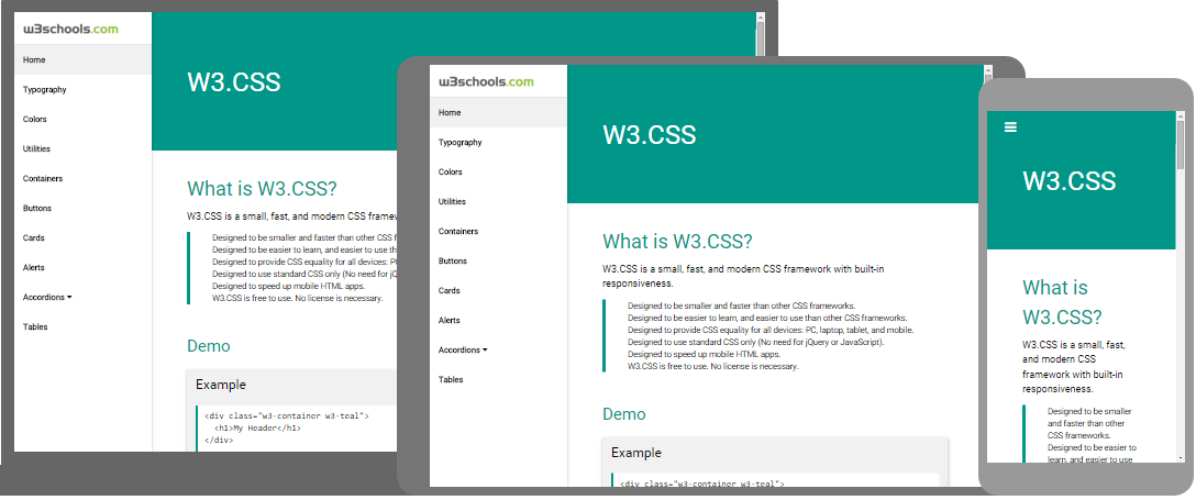
W3.CSS
Faster and Better
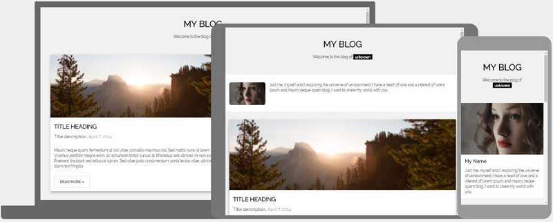
Responsive Web Sites
What is W3.CSS?
W3.CSS is a modern CSS framework with built-in responsiveness:
W3.CSS is Free
W3.CSS is free to use. No license is necessary.
Easy to Use
Example
<div class="w3-container w3-teal">
<h1>My Header</h1>
</div>
<img
src="img_car.jpg" alt="Car">
<div class="w3-container">
<p>A car is a wheeled, self-powered motor vehicle used for transportation.</p>
</div>
<div class="w3-container w3-teal">
<p>My Footer</p>
</div>
Try It Yourself »
How To
To use W3.CSS in your web site, just add a link to "w3.css" from your web pages:
Example
<!DOCTYPE html>
<html>
<meta
name="viewport" content="width=device-width, initial-scale=1">
<link rel="stylesheet"
href="http://www.w3schools.com/lib/w3.css">
Try It Yourself »
Or download w3.css from w3css_downloads and add a link to a folder on your own web site:
Example
<!DOCTYPE html>
<html>
<meta
name="viewport" content="width=device-width, initial-scale=1">
<link rel="stylesheet"
href="/lib/w3.css">
Try It Yourself »
W3.CSS Web Site Templates
We have created some responsive W3CSS templates for you to use.
You are free to modify, save, share, use or do whatever you want with them: