CSS linear-gradient() Function
Example
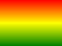
The following example shows a linear gradient that starts at the top. It starts red, transitioning to yellow, then to blue:
#grad {
background: -webkit-linear-gradient(red,yellow,blue); /* Safari 5.1-6.0 */
background: -o-linear-gradient(red,yellow,blue); /*
Opera 11.1-12.0 */
background: -moz-linear-gradient(red,yellow,blue); /*
Firefox 3.6-15 */
background: linear-gradient(red,yellow,blue); /* Standard
syntax */
}
Try it Yourself »
Definition and Usage
The linear-gradient() function creates an "image" which represents a linear gradient of colors.
To create a linear gradient you must define at least two color stops. Color stops are the colors you want to render smooth transitions among. You can also set a starting point and a direction (or an angle) along with the gradient effect.
Example of Linear Gradient:
| Version: | CSS3 |
|---|
Browser Support
The numbers in the table specify the first browser version that fully supports the function.
Numbers followed by -webkit-, -moz-, or -o- specify the first version that worked with a prefix.
| Function | |||||
|---|---|---|---|---|---|
| linear-gradient() | 26.0 10.0 -webkit- |
10.0 | 16.0 3.6 -moz- |
6.1 5.1 -webkit- |
12.1 11.1 -o- |
CSS Syntax
background: linear-gradient(direction, color-stop1,
color-stop2, ...);
| Value | Description |
|---|---|
| direction | Defines a starting point and a direction (or an angle) along with the gradient effect. |
| color-stop1, color-stop2,... | Color stops are the colors you want to render smooth transitions among. This value consists of a color value, followed by an optional stop position (a percentage between 0% and 100% or a length along the gradient axis). |

More Examples
Example
A linear gradient that starts from the left. It starts red, transitioning to blue:
#grad {
background: -webkit-linear-gradient(left,
red , blue); /* Safari 5.1 to 6.0 */
background: -o-linear-gradient(right, red,
blue); /* Opera 11.1 to 12.0 */
background: -moz-linear-gradient(right,
red, blue); /* Firefox 3.6 to 15 */
background: linear-gradient(to
right, red , blue); /* Standard syntax */
}
Try it Yourself »
Example
A linear gradient that starts at top left (and goes to bottom right):
#grad {
background: -webkit-linear-gradient(left
top, red , blue); /* Safari 5.1 to 6.0 */
background: -o-linear-gradient(bottom
right, red, blue); /* Opera 11.1 to 12.0 */
background: -moz-linear-gradient(bottom
right, red, blue); /* Firefox 3.6 to 15 */
background:
linear-gradient(to bottom right, red , blue); /* Standard syntax */
}
Try it Yourself »
Example
A linear gradient with a specified angle:
#grad {
background: -webkit-linear-gradient(180deg,
red, blue); /* Safari 5.1 to 6.0 */
background: -o-linear-gradient(180deg, red,
blue); /* Opera 11.1 to 12.0 */
background: -moz-linear-gradient(180deg,
red, blue); /* Firefox 3.6 to 15 */
background:
linear-gradient(180deg, red, blue); /* Standard syntax */
}
Try it Yourself »
Example
A linear gradient with multiple color stops:
#grad {
/* For Safari 5.1 to 6.0 */
background: -webkit-linear-gradient(left,red,orange,yellow,green,blue,indigo,violet);
/* For Opera 11.1 to 12.0 */
background:
-o-linear-gradient(left,red,orange,yellow,green,blue,indigo,violet);
/*
For Fx 3.6 to 15 */
background: -moz-linear-gradient(left,red,orange,yellow,green,blue,indigo,violet);
/* Standard syntax */
background: linear-gradient(to right,
red,orange,yellow,green,blue,indigo,violet);
}
Try it Yourself »
Example
A linear gradient with transparency:
#grad {
background: -webkit-linear-gradient(left,rgba(255,0,0,0),rgba(255,0,0,1)); /*Safari
5.1-6*/
background:
-o-linear-gradient(right,rgba(255,0,0,0),rgba(255,0,0,1)); /*Opera 11.1-12*/
background: -moz-linear-gradient(right,rgba(255,0,0,0),rgba(255,0,0,1));
/*Fx 3.6-15*/
background: linear-gradient(to right, rgba(255,0,0,0),
rgba(255,0,0,1)); /*Standard*/
}
Try it Yourself »
Related Pages
CSS tutorial: CSS3 Gradients
 CSS Functions Reference

